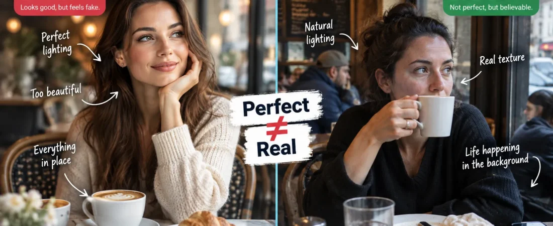
7 Mistakes That Give Them Away—and How to Make Them Look More Natural
If you’re trying to make AI images look real, the biggest problem is no longer obvious mistakes like extra fingers. Modern AI images can look astonishingly realistic and still have a strange quality that makes people recognize them almost immediately.
Sometimes you can’t even explain what’s wrong.
The hands look fine.
The face looks fine.
The lighting is beautiful.
Nothing is obviously broken.
And yet your brain says:
That’s AI.
This is one of the most interesting problems in generative imagery today.
For years, identifying AI images was almost a game of spotting mistakes.
Count the fingers.
Look for impossible earrings.
Read the mangled text.
Inspect the background.
Those clues still matter.
But the best image models have become much better at avoiding obvious failures.
Now something subtler gives them away.
The image can be too perfect.
The Strange Problem of AI Perfection
Imagine a photograph of someone drinking coffee in a small café.
In a real photograph, you might see:
- a slightly crooked chair,
- fingerprints on the glass,
- an awkward reflection,
- a napkin partially hidden under the plate,
- uneven light on the face,
- someone blurred in the background,
- a coffee stain nobody intentionally placed there.
None of those details make the photograph better.
But together, they make the world believable.
Now imagine the AI version.
Beautiful person.
Perfect latte.
Perfect table.
Perfect window light.
Perfect background blur.
Every object positioned as if an invisible art director spent an hour arranging it.
It looks better than reality.
And that’s exactly the problem.
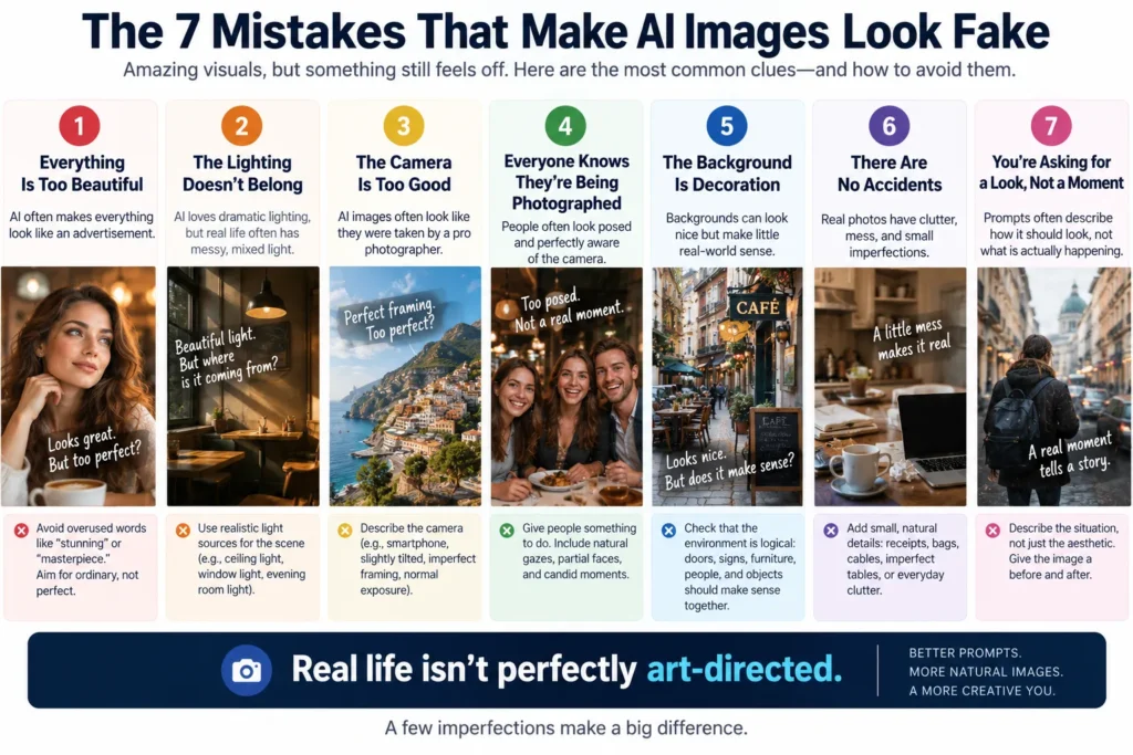
Mistake #1: Everything Is Too Beautiful
This is probably the first thing I’d change.
Many AI prompts accidentally ask for perfection.
Words such as:
stunning, cinematic, beautiful, masterpiece, ultra-detailed, perfect lighting, professional photography
pile aesthetic pressure onto the generation.
The model responds exactly as requested.
It beautifies everything.
The person becomes attractive.
The room becomes stylish.
The sunset becomes spectacular.
The coffee develops commercial-grade foam.
Even an ordinary Tuesday morning starts looking like a luxury advertising campaign.
That’s useful when you’re actually making an advertisement.
It’s less useful when you’re trying to make something feel real.
Try asking for ordinary
Instead of:
Beautiful young woman drinking coffee in a cozy Paris café, cinematic lighting, stunning photography.
Try:
Woman in her early 30s drinking coffee alone at a small neighborhood café, overcast morning, ordinary clothes, slightly cluttered table, natural window light, candid photograph taken from the next table.
Notice what changed.
We stopped telling AI to impress us.
We started giving it a situation.
Mistake #2: The Lighting Doesn’t Belong to the Scene
AI loves dramatic lighting.
Rim light.
Golden light.
Perfectly illuminated faces.
Beautiful separation between subject and background.
The problem is that real life frequently has terrible lighting.
Office ceilings are ugly.
Restaurants have mixed color temperatures.
Bedrooms have dark corners.
Cloudy days flatten faces.
Phone photographs contain blown highlights.
If you’re generating a casual family photograph and the subject has Hollywood-quality three-point lighting, something feels wrong even if the viewer can’t explain why.
Ask:
Where is the light actually coming from?
If it’s a kitchen at 8 p.m., perhaps there is:
- one warm ceiling light,
- light from the refrigerator,
- darkness beyond the window.
Describe that.
Physical lighting is often more believable than aesthetic lighting.
Mistake #3: The Camera Is Too Good
This sounds ridiculous.
But it’s real.
AI images frequently resemble photographs taken by extraordinarily competent photographers.
Perfect framing.
Perfect exposure.
Perfect subject separation.
Perfect focus.
Every time.
Real photographs aren’t like that.
Especially phone photographs.
Sometimes the camera is:
- slightly tilted,
- too close,
- badly positioned,
- focused on the wrong object,
- partially blocked,
- exposed for the window instead of the face.
Those aren’t necessarily defects.
They’re evidence that a photograph happened.
Camera language matters
Instead of:
Photorealistic image of a family eating dinner.
Try:
Casual smartphone photo taken while sitting at the same table, slightly wide lens, imperfect framing, one person’s arm partially cropped, background sharper than ideal, normal indoor exposure.
Now you’re not merely describing the subject.
You’re describing how the image came into existence.
That’s much more powerful.
Mistake #4: Everyone Knows They’re Being Photographed
AI people often behave like models.
Even when they supposedly aren’t modeling.
Their bodies are open toward the camera.
Faces are visible.
Expressions are readable.
Hands are conveniently positioned.
Nobody blocks anybody else.
Real life is much messier.
People look away.
Someone turns their back.
A child hides behind another person.
Someone is halfway through chewing.
A face is partially obscured.
One person notices the camera while another doesn’t.
If every person in a candid scene is perfectly available to the viewer, the image starts feeling staged.
Give people something to do
Don’t prompt:
Three friends sitting together at a restaurant.
Try:
Three friends at a crowded restaurant; one is reading something on her phone, another is reaching across the table for a plate, the third is mid-sentence and looking at the person beside him rather than the camera.
Now the people have relationships with each other.
Not just with the lens.
Mistake #5: The Background Is Decoration Instead of a Place
This is one of my favorite tests.
Ignore the main subject.
Look only at the background.
Does it make sense?
AI can create a background that feels visually convincing without being logically convincing.
A restaurant may contain:
- tables with strange spacing,
- chairs nobody could sit in,
- objects with unclear purposes,
- repeating decorations,
- people interacting with nothing,
- architecture that quietly contradicts itself.
At first glance, it’s fine.
Look longer and the world begins to dissolve.
Real places have function.
Doors lead somewhere.
Chairs face tables.
Signs exist for reasons.
Objects show evidence of use.
The strongest AI images don’t just need beautiful backgrounds.
They need causal backgrounds.
Mistake #6: The Image Has No Accidents
Real photographs contain accidents.
That’s something AI struggles to understand because prompts usually describe what we want.
Nobody types:
Put an ugly plastic bag in the corner.
But real life doesn’t ask permission.
A delivery box sits beside the door.
Someone leaves a jacket over a chair.
A cable crosses the floor.
A child’s toy appears in an otherwise adult room.
The supermarket receipt is still on the table.
These details create history.
They imply something happened before the photograph.
Add evidence of a world
Instead of filling your prompt with visual adjectives, add one or two details that imply previous activity.
Half-finished coffee beside an open notebook.
Wet umbrella leaning against the wall.
Grocery bag still sitting on the kitchen floor.
One chair pulled away from the table.
Small details can make an AI scene feel much larger than the frame.
Mistake #7: You’re Asking for a Look Instead of a Moment
This may be the biggest difference.
Weak AI prompts often describe what the image should look like.
Strong prompts increasingly describe what is happening.
Compare:
Cinematic photograph of a businessman in an office.
with:
A project manager alone in the office after everyone has left, jacket hanging over the back of his chair, staring at a spreadsheet while reheated coffee sits beside the keyboard, photographed from the doorway.
The second prompt contains a story.
You can imagine what happened before the frame.
You can imagine what might happen next.
That’s what makes photographs interesting.
Not megapixels.
Not cinematic lighting.
Not how many times the word “realistic” appears in the prompt.
Stop Writing Image Prompts Like Shopping Lists
There’s another problem I see frequently.
Prompts become lists:
woman, café, laptop, coffee, Paris, morning, cinematic, realistic, 8K, detailed, DSLR, bokeh.
Technically, all the ingredients are there.
But nothing connects them.
Try thinking like a director instead.
Who is this person?
Why are they there?
What are they doing?
Where is the camera?
Who is holding it?
What happened thirty seconds earlier?
What is imperfect about the environment?
You don’t necessarily need to answer every question in the final prompt.
But asking them changes the image you’re trying to create.
The Five-Layer Prompt I Prefer
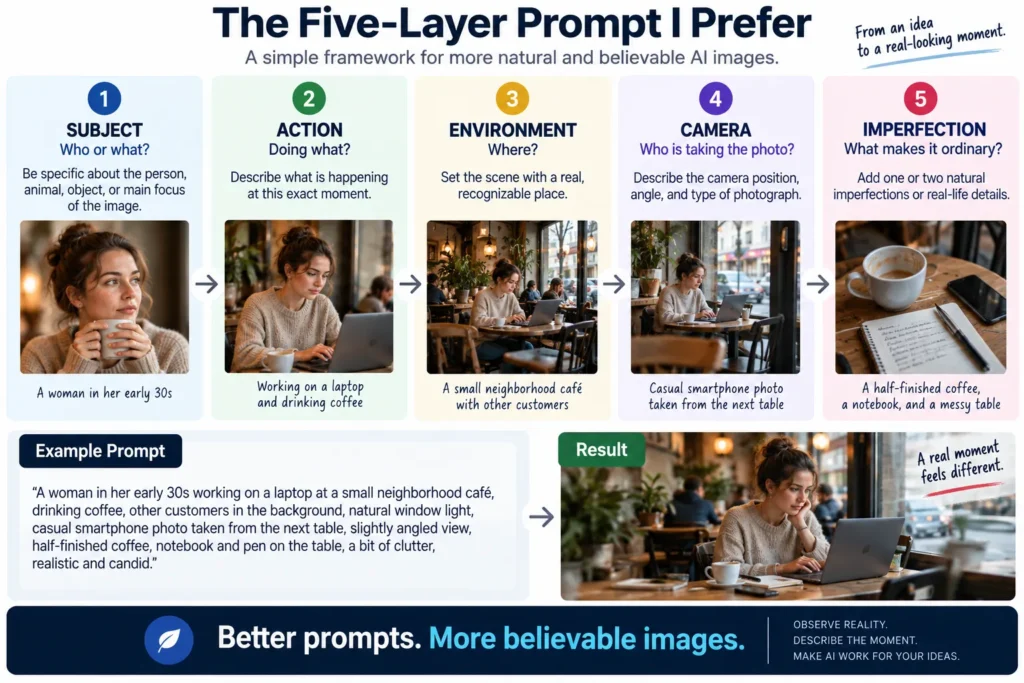
If you want to make AI images look real without relying on endless style keywords, I’d structure the idea in five layers.
1. Subject
Who or what is actually in the image?
2. Action
What is happening at this exact moment?
3. Environment
What kind of real place surrounds the subject?
4. Camera
Where is the photographer and what kind of photograph are they taking?
5. Imperfection
What prevents the scene from looking artificially arranged?
For example:
A father helping his daughter put on her shoes near the entrance of a small apartment before school, backpacks and one grocery bag near the door, early morning window light mixed with the hallway lamp, casual smartphone photo taken by another family member from several steps away, slightly crooked framing and one shoe partly outside the frame.
No:
masterpiece.
No:
breathtaking.
No:
award-winning.
The realism comes from the situation.
The Goal Isn’t to Fool People
There’s an important distinction here.
Making an AI image feel more natural doesn’t have to mean disguising AI-generated content in situations where disclosure or provenance matters.
The creative lesson is much simpler.
If you want believable imagery, study reality.
Reality is:
- inconsistent,
- asymmetrical,
- contextual,
- imperfect,
- full of consequences.
AI naturally wants to resolve uncertainty into something visually pleasing.
Your job is often to put some uncertainty back.
That’s when generated imagery starts feeling less like a demonstration of an image model and more like a moment someone could actually have photographed.
Faces Are Better Now. Skin Is Still a Clue.
The old version of AI realism had an obvious problem.
Faces were wrong.
Eyes pointed in slightly different directions.
Teeth merged.
Ears behaved strangely.
Modern image models have improved enormously.
Now the problem is often subtler.
The face is too resolved.
Look closely at real skin.
It contains:
- pores,
- tiny hairs,
- uneven color,
- redness,
- shadows under the eyes,
- slight asymmetry,
- wrinkles that behave differently across the face,
- areas that reflect more light than others.
AI sometimes compresses all of that complexity into something aesthetically pleasing.
Skin becomes smooth but detailed.
Imperfect but somehow perfectly imperfect.
It looks like someone applied expensive skincare, professional makeup, studio lighting, and subtle retouching to a supposedly casual photograph.
That’s why simply adding:
realistic skin texture
doesn’t always solve the problem.
You may just get more beautifully rendered artificial skin.
Give the Face a Life, Not More Texture
Instead of describing pores, describe the person.
Maybe they:
- slept badly,
- just came in from the cold,
- spent the afternoon outside,
- aren’t wearing makeup,
- have slightly flushed cheeks after walking,
- are concentrating rather than posing.
Context creates visual consequences.
That’s often more convincing than technical realism vocabulary.
Compare:
Hyperrealistic woman, detailed skin, visible pores, photorealistic face.
with:
Woman in her late 30s waiting for an early train after a short night’s sleep, no makeup, slightly tired eyes, cheeks still red from the cold outside, looking past the camera toward the departure board.
The second prompt doesn’t demand realism.
It gives the model reasons for realism to appear.
Hands Still Deserve a Second Look
Hands have improved dramatically too.
But I would still inspect them.
Not because every AI image has six fingers.
That era is fading.
The subtler problems are:
- strange finger lengths,
- impossible grips,
- objects passing through fingers,
- inconsistent fingernails,
- wrists bending unnaturally,
- two hands interacting incorrectly,
- fingers disappearing behind objects in impossible ways.
Hands are difficult because they don’t merely have anatomy.
They do things.
Holding a wine glass creates a physical relationship between fingers and glass.
Typing creates a relationship between hands and keyboard.
Tying a shoe requires both hands to interact with laces in a very specific way.
So don’t only count fingers.
Ask:
Could a real hand physically be doing this?
That’s the better test.
Text Is No Longer an Automatic Giveaway Either
Text used to be one of the easiest ways to identify an AI image.
Menus became nonsense.
Signs contained impossible letters.
Product packaging dissolved into pseudo-language.
That is improving quickly.
But text still deserves inspection because even one incorrect character can destroy an otherwise excellent commercial image.
This matters especially for:
- packaging,
- storefronts,
- advertisements,
- book covers,
- dashboards,
- posters,
- clothing,
- branded products.
For important text, I prefer a simple workflow.
Generate the visual first.
Then add mission-critical text in a proper design tool whenever possible.
Don’t gamble an entire advertisement on whether the model spells a six-word headline correctly.
Product Photography Has Different Rules
Natural-looking lifestyle photography benefits from imperfection.
Product photography is different.
A commercial product often should look controlled.
The bottle should be clean.
The lighting should be deliberate.
The composition may be highly polished.
So the goal isn’t always:
Make it imperfect.
The goal is:
Make it physically believable.
If you’re generating a product scene, check:
- product dimensions,
- label placement,
- logo,
- cap shape,
- material,
- reflections,
- shadows,
- contact with the surface,
- repeated product consistency.
Imagine generating a perfume bottle.
The first image is perfect.
Generate another angle.
Now the bottle is slightly wider.
The logo moved.
The cap changed.
That’s not a realism problem.
It’s an identity problem.
For commercial imagery, consistency can matter more than photographic imperfection.
Lifestyle Images Need Evidence of Use
Now imagine the same perfume bottle on someone’s bathroom shelf.
Suddenly perfection becomes suspicious again.
A real bathroom might contain:
- a toothbrush,
- water marks,
- another bottle partially hidden,
- a folded towel,
- a cabinet reflection,
- objects placed without aesthetic intention.
The product can remain beautiful.
The world around it should feel used.
This distinction is useful:
Product hero image
→ control.
Product lifestyle image
→ context.
Trying to use the same prompting philosophy for both often produces disappointing results.
Travel Images Have Their Own AI Look
AI travel imagery has a recognizable temptation.
Everything becomes spectacular.
The streets are clean.
The weather is perfect.
The architecture glows.
There are just enough people to make the place feel alive, but never enough to block the view.
Real travel rarely cooperates like that.
A believable travel image may contain:
- tourists,
- construction barriers,
- cloudy weather,
- parked scooters,
- imperfect pavement,
- shadows crossing the subject,
- signs,
- ordinary businesses,
- people wearing practical clothes rather than fashion-editorial outfits.
If you’re creating travel imagery, don’t ask only:
Does this place look beautiful?
Ask:
Does this place behave like the real place?
Architecture matters.
Street furniture matters.
Weather matters.
Local details matter.
A beautiful generic Mediterranean street isn’t automatically Barcelona, Naples, Dubrovnik, or Valencia.
Place identity is built from specifics.
Thumbnails Are Allowed to Look Artificial
Here’s where I would deliberately break many of the rules in this article.
A thumbnail isn’t pretending to be a candid photograph.
Its job is to communicate instantly.
That may justify:
- dramatic lighting,
- exaggerated expression,
- strong separation,
- simplified background,
- unusually clean composition,
- large readable text,
- impossible visual metaphors.
The problem isn’t that AI imagery looks artificial.
The problem is using the wrong visual language for the job.
A YouTube thumbnail can be theatrical.
A supposedly documentary photograph should probably not be.
Realism isn’t always the goal.
Intent is.
Negative Prompts Aren’t the First Thing I’d Fix
When an image looks artificial, people often start adding negatives:
no extra fingers, no plastic skin, no distorted face, no bad anatomy, no unrealistic lighting…
That can help in systems that meaningfully support negative prompting.
But I wouldn’t start there.
The bigger problem may be the positive prompt.
If you’ve asked for:
stunning cinematic beautiful perfect professional ultra-detailed portrait
and then add:
no artificial appearance
you’re fighting your own instructions.
Fix the scene first.
Then fix specific failures.
A strong prompt gives the model a believable world.
A negative prompt cleans up remaining problems.
Before and After: The Restaurant Photo
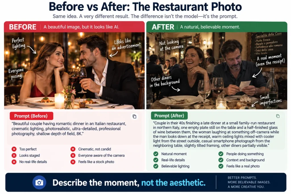
Let’s make the difference concrete.
Before
Beautiful couple having romantic dinner in an Italian restaurant, cinematic lighting, photorealistic, ultra-detailed, professional photography, shallow depth of field, 8K.
There’s nothing technically wrong with that.
It’s also exactly the type of prompt that can produce an unmistakably generated image.
After
Couple in their 40s finishing a late dinner at a small family-run restaurant in northern Italy, one empty plate still on the table and a half-finished glass of wine between them, the woman laughing at something happening off-camera while the man looks down at the receipt, warm ceiling lights mixed with cooler light from the street outside, casual smartphone photograph from the neighboring table, slightly tilted framing, other diners partially visible behind them.
The second prompt contains fewer claims about image quality.
It contains far more information about reality.
Before and After: The Office Photo
Before
Professional businessman working in modern office, realistic, cinematic, dramatic lighting, detailed, corporate photography.
After
Project manager still at his desk after most coworkers have left, sleeves rolled up, comparing two versions of a spreadsheet on separate monitors, empty meeting room visible behind him, overhead office lights still on, jacket hanging from the chair, ordinary corporate office photographed from several desks away with a phone camera.
Again:
less beauty.
More causality.
Before and After: The Family Travel Photo
Before
Happy family visiting Rome, beautiful sunny day, cinematic travel photography, photorealistic.
After
Parents with two children stopping beside a fountain during a hot afternoon in Rome, one child drinking water while the other is looking at a souvenir stand instead of the camera, backpacks on both parents, tourists passing behind them, hard midday sunlight, casual phone photo taken by another family member with slightly awkward framing.
The second version gives everyone something to do.
That’s one of the simplest ways to reduce the “AI photoshoot” feeling.
My Realism Checklist
Before publishing a realistic AI image, I’d inspect six layers.
1. People
Do bodies make physical sense?
Hands?
Eyes?
Teeth?
Hair?
Interaction?
2. Objects
Does every important object have a clear shape and purpose?
Can someone actually hold or use it?
3. Space
Do walls, doors, furniture, roads, windows, and perspective agree with one another?
4. Light
Can you identify plausible light sources?
Do shadows and reflections agree with them?
5. Text
Are signs, labels, screens, packaging, and logos correct?
6. Story
Does the scene look like something was actually happening—or like everything exists only because you requested an image?
That final question catches surprisingly many problems.
The 30-Second AI Image Check
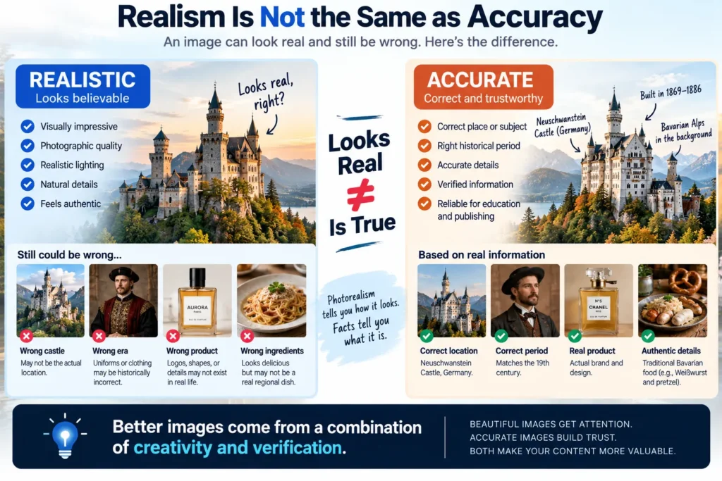
You don’t need to spend ten minutes zooming into every generation.
For everyday publishing, I’d use a fast inspection.
First 5 Seconds: Overall Feeling
Don’t zoom.
Look normally.
Does anything feel strangely polished, symmetrical, or staged?
Trust that first reaction.
Next 5 Seconds: Face and Hands
Check the highest-risk anatomy.
Next 5 Seconds: Main Object
If the image is about a product, building, food, vehicle, or other identifiable object, verify it.
Next 5 Seconds: Background
Look behind the subject.
Not at the subject.
Next 5 Seconds: Text and Logos
Any visible text deserves attention.
Final 5 Seconds: Physics
Ask:
Could this scene physically exist?
Light.
Reflections.
Hands.
Furniture.
Objects.
Perspective.
Thirty seconds won’t catch everything.
It will catch a surprising amount.
Don’t Zoom In So Far That You Forget the Image
There’s another trap.
Once people learn to inspect AI images, they sometimes become obsessed with microscopic errors.
A strange fork in the far background.
One impossible window reflection.
A person’s hand that looks slightly odd at 400% zoom.
Context matters.
Ask:
Will a normal viewer actually see this?
If the image is a small blog thumbnail, some imperfections may be irrelevant.
If it’s a full-page advertisement for a luxury product, the standard changes.
Quality control should match how the image will actually be used.
Consistency Matters More Than Perfection in a Series
Suppose you’re creating ten illustrations for one article.
Each image is individually beautiful.
But:
- one is photorealistic,
- another looks like 3D animation,
- another has pastel editorial colors,
- another is dark cyberpunk.
Individually good.
Collectively messy.
This is another area where AI exposes an important creative principle.
A single image can survive inconsistency.
A brand cannot.
For a series, define:
- visual language,
- camera style,
- typography,
- aspect ratio,
- level of realism,
- recurring colors,
- illustration style.
Then keep them stable.
The goal isn’t simply generating ten good images.
It’s generating ten images that look like they belong to the same publication.
The same challenge becomes even harder in AI video, where character, environment, and visual continuity have to survive across moving shots.
Realism Is Not the Same as Accuracy
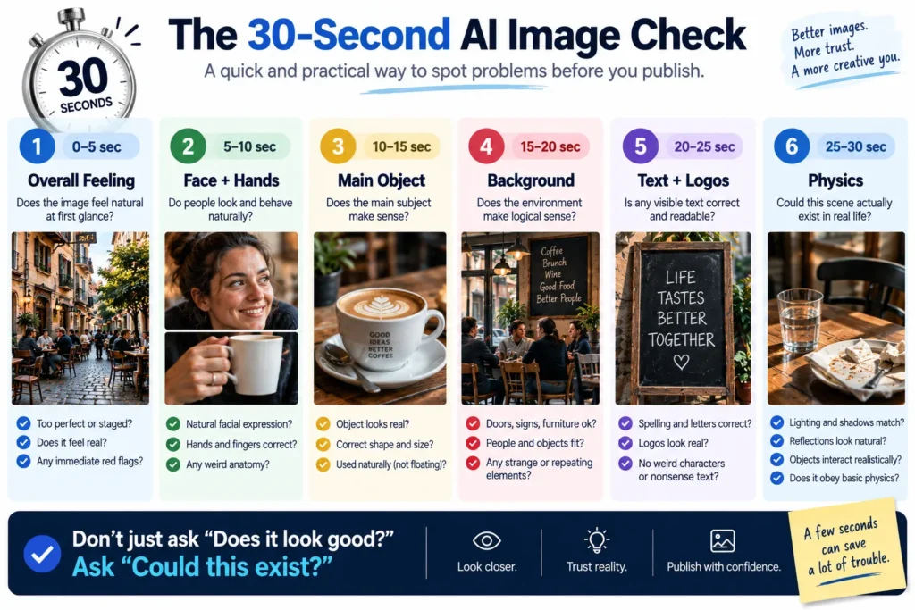
This distinction becomes especially important for informational content.
An AI-generated castle can look perfectly realistic.
It may still be the wrong castle.
A historical uniform can look convincing.
It may still belong to the wrong century.
A scientific diagram can look professional.
It may still be scientifically wrong.
A plate of regional food can look delicious.
It may contain ingredients that don’t belong there.
Photorealism tells you how convincing the pixels are.
It tells you nothing about whether the content is true.
For educational, travel, historical, medical, product, or technical content, factual verification still matters.
Sometimes the most dangerous AI image isn’t the obviously broken one.
It’s the beautiful one that’s confidently wrong.
When You Shouldn’t Try to Make AI Look Real
Sometimes realism creates unnecessary risk.
If you’re explaining:
- an abstract AI concept,
- a workflow,
- a comparison,
- a decision tree,
- a process,
an infographic or illustration may communicate more honestly and clearly than a fabricated photograph.
You don’t need to make every idea look like it happened in the physical world.
This is especially useful for editorial publishing.
Use photographs when photographic reality adds value.
Use diagrams when relationships matter.
Use illustrations when imagination matters.
Use screenshots when the actual interface matters.
Choose the visual form based on the information.
Not based on which generator you currently enjoy using.
This is another example of why human judgment still matters in AI workflows: the tool can generate the asset, but the creator must decide which form actually communicates the idea best.
The Prompt Formula I’d Keep
If I had to reduce this entire article to one reusable framework, it would be:
WHO
DOING WHAT
WHERE
PHYSICAL CONDITIONS
CAMERA POSITION
ONE OR TWO IMPERFECTIONS
For example:
Elderly man repairing a bicycle outside his small garage, kneeling beside the rear wheel while tools are spread on an old towel, cloudy afternoon with soft natural light from the open garage door, photographed by someone standing several meters away with an ordinary phone camera, slightly off-center composition and a parked car partially blocking the far edge of the frame.
That prompt isn’t universally perfect.
No prompt is.
But it asks the model to construct a moment rather than decorate a subject.
That’s the important part.
Final Thoughts
AI images will continue becoming harder to identify.
Hands will improve.
Text will improve.
Faces will improve.
Physics will improve.
Some of today’s obvious tells will disappear.
That’s why I wouldn’t build a realism strategy around fixing six fingers.
The deeper problem is more interesting.
AI tends to create the world we ask for.
And humans have a habit of asking for worlds that are far more perfect than the one we actually live in.
Beautiful light.
Beautiful people.
Beautiful rooms.
Perfect composition.
Nothing out of place.
Then we’re surprised when the result feels artificial.
Maybe the solution isn’t asking AI to become better at reality.
Maybe we need to become better at observing reality ourselves.
Look around your room.
Notice what isn’t aligned.
Look at photographs on your phone that you never intended to publish.
Notice the strange crops.
The bad light.
The background distractions.
The moments when nobody was ready.
That’s the visual language AI prompts often forget.
Realism doesn’t come from adding the word photorealistic five times.
It comes from understanding why real photographs look the way they do.
Give AI a world with causes.
Give people something to do.
Give objects a reason to exist.
Give the camera a physical location.
And occasionally, let something be ugly.
The result may become less perfect.
It may also become much more believable.
Frequently Asked Questions
Why do AI-generated images still look fake?
Modern AI images often look artificial because of subtler issues than obvious anatomical errors: overly perfect composition, unrealistic lighting, staged behavior, overly polished skin, inconsistent backgrounds, weak physical logic, and a lack of ordinary imperfections.
How can I make AI images look more realistic?
Describe a believable situation rather than stacking aesthetic adjectives. Specify what the subject is doing, the physical environment, plausible lighting, camera position, and a few natural imperfections.
Should I use words like photorealistic, 8K, and ultra-detailed?
They can influence style, but adding more quality-related adjectives doesn’t automatically create realism. Situational detail, physical consistency, camera logic, and believable human behavior are often more useful.
Do negative prompts make AI images more realistic?
They can help correct specific unwanted traits in tools that support them, but they shouldn’t compensate for a poorly constructed main prompt. Start by making the scene itself believable.
What should I check before publishing an AI image?
Inspect people, hands, important objects, background geometry, lighting, reflections, text, logos, and whether the scene makes physical and contextual sense.
Is a photorealistic AI image necessarily accurate?
No. Photorealism describes visual appearance, not factual accuracy. Historical locations, products, scientific diagrams, travel scenes, architecture, and other factual subjects should still be independently verified.